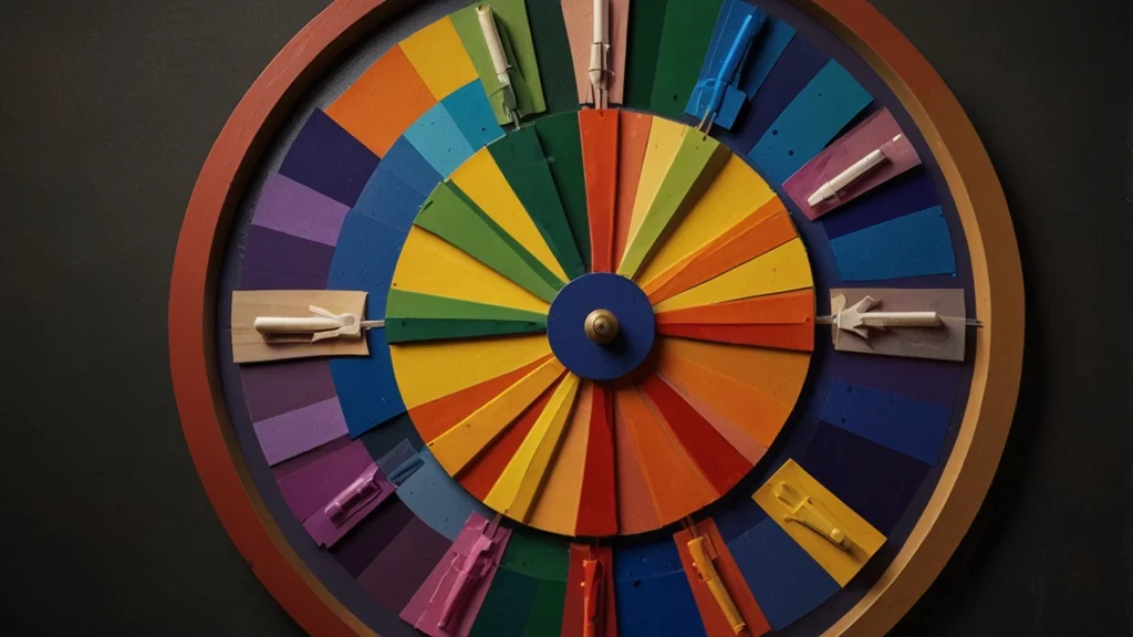
The complementary color wheel is a fundamental tool in art and design. It helps create visual harmony and balance. This article will explore its structure, significance, and practical applications.
What Is a Color Wheel?
A color wheel is a circular diagram. It shows the relationships between colors. The wheel is divided into primary, secondary, and tertiary colors.
Primary colors are red, blue, and yellow. These colors cannot be made by mixing others.
Secondary colors are created by mixing primary colors. They include green, orange, and purple.
Tertiary colors come from mixing primary and secondary colors. They offer a wider spectrum of hues.
The Concept of Complementary Colors
Complementary colors are opposite each other on the color wheel. When paired, they create contrast and vibrancy. This contrast can be striking and dynamic.
For example, red and green are complementary. Blue and orange also share this relationship. Purple and yellow complete the set.
Using complementary colors effectively can enhance visual appeal. They are used in various fields, including graphic design, fashion, and interior decor.
Importance of Complementary Colors
Using complementary colors can add depth to artwork. They create balance and visual interest. When placed next to each other, they intensify each other’s brightness.
This phenomenon is known as simultaneous contrast. It makes colors appear more vibrant. Artists and designers often use this technique to draw attention to certain elements.
In branding, complementary colors can convey specific emotions. For example, blue and orange can evoke a sense of energy and trust.
Creating a Complementary Color Palette
When creating a complementary color palette, consider your objectives. Think about the mood you want to convey.
Start with a primary color. Then, find its complementary color on the wheel. For example, if you choose blue, its complementary color is orange.
Next, select additional colors that blend well. You can use shades and tints of the primary and complementary colors. This approach will create a cohesive look.
Experimenting with different combinations can yield interesting results.
Applications in Art
In painting, complementary colors can bring life to a canvas. Artists often use these colors to create shadows and highlights.
For instance, using a complementary color can make a subject stand out. This technique enhances the overall composition.
Famous artists, like Vincent van Gogh, used complementary colors extensively. His works often featured vibrant contrasts that captivated viewers.
Applications in Design
In graphic design, complementary colors are vital. They can attract attention and guide viewers’ eyes.
Web designers often use these colors for buttons and links. This draws users’ attention and encourages interaction.
In branding, complementary colors can create a strong identity. They help a brand stand out in a crowded marketplace.
Consider companies like Pepsi, which uses blue and red effectively. Their logo is instantly recognizable due to this color choice.
Complementary Colors in Fashion
Fashion designers also utilize complementary colors. The right color combinations can create stunning outfits.
For instance, a blue dress paired with orange accessories can make a bold statement.
When dressing, consider the mood and occasion. Complementary colors can help you express your style confidently.
Mixing different textures and patterns with complementary colors can add depth to your look.
The Psychological Impact of Complementary Colors
Colors have a psychological impact on our emotions and perceptions. Complementary colors can evoke different feelings.
For example, blue is often associated with calmness. Orange, on the other hand, exudes energy. Together, they can create a sense of balance.
Understanding these associations can enhance your design choices. Consider the emotions you want to evoke in your audience.
Challenges of Using Complementary Colors
While complementary colors can be powerful, they can also be challenging. Overuse of high contrast can be jarring.
It’s important to strike a balance. Use complementary colors strategically to avoid overwhelming the viewer.
Subtlety can enhance the impact of your design. Consider incorporating neutral tones to soften the contrast.
This approach can create a more sophisticated and polished look.
Tools for Working with Complementary Colors
Many tools are available to help you explore complementary colors. Online color generators can provide instant palettes.
Software like Adobe Color allows you to experiment with different color schemes.
Mobile apps also help you identify complementary colors easily. These tools can enhance your creative process.
Conclusion
The complementary color wheel is an essential tool in art and design. Understanding its principles can elevate your work.
By mastering the use of complementary colors, you can create visually stunning compositions.
Whether in painting, design, or fashion, complementary colors offer endless possibilities. Explore and experiment with them to find your unique style.
Creating a balance of colors can lead to compelling visual narratives. Embrace the power of complementary colors in your projects.


